HR analytics is a rapidly growing field, but many companies are lagging in implementing it in their own HR departments (See here for more information). The first step to being able to bring more analytics into your HR department starts with the right tools and software. This article will go through the top tools and compare them to help make it easier to find the right one for you company.
- R
R is one of the most common and powerful statistics and visualization programs currently available. Not only can it create stunning graphs, efficient models, and work with extremely large datasets, the best part is it’s completely free to use. R and all the additional packages and environments to use with it are Open Source meaning they are community made and require no payments.
The most popular Integrated Development Environment (IDE) for R is RStudio which allows the user to view four panels rather than just a command box. RStudio is shown in the picture below and the panels let you see your code (top left), the command output (bottom left), the environment and data (top right), and any graphical or help page outputs (bottom right).
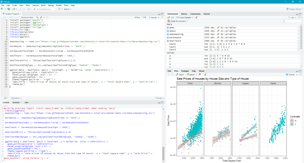
R can also work with much larger datasets than traditional visualization software, like Excel, and can also have multiple datasets loaded with analysis that makes them interact.
One of the most powerful aspects of R is the ability to access a vast library of packages, or add-ons, depending on what type of analysis you need to run. Packages are easy to install and use and most have documentation and user forums in case you need help. A commonly used package for visualization is ggplot, which was used to create the visualization seen above.
Overall, R is an amazing software and is one of the only free-to-use ones available on this list. You can download R here and RStudio here.
- Python
Python is a newer programming language that has become widespread in the data analytics community for its ease-of-use for data cleaning and analysis. Since both R and Python are languages, they have a lot of similarity in how they work and their level of difficulty but are also the two most flexible and powerful options on this list. Overall, Python is less targeted to data analytics and therefore has less functionality but is generally an easier language to learn at first.
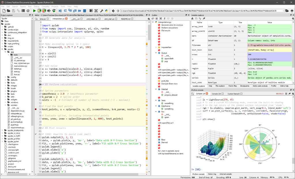
Since Python is a programming language, an IDE helps organize and view the code and visualizations together. Some of the most common IDEs for analytics include Spyder, PyCharm, and Jupyter. All three are open source, meaning they are free to use and usually have a large community for support and documentation.
Overall, when comparing if you should use Python or R, look at the needs of your department. R is much stronger in statistical analysis and is targeted to working with data whereas Python has strong visualization capabilities but is not geared towards statistics or data in general. Another point to note is Python is powerful when it comes to cleaning and analyzing textual data.
For downloads, you can find Python here, and for the IDEs, you can find Spyder here, PyCharm here, and Jupyter here.
- Tableau
Tableau is a user-friendly visualization that has become popular due to the drag-and-drop features for creating visuals. While R and Python were focused on statistics and individual visualizations, Tableau works to create powerful, visual dashboards that a user can interact with. Tableau allows users to aggregate multiple data sources and create visualizations based on them.
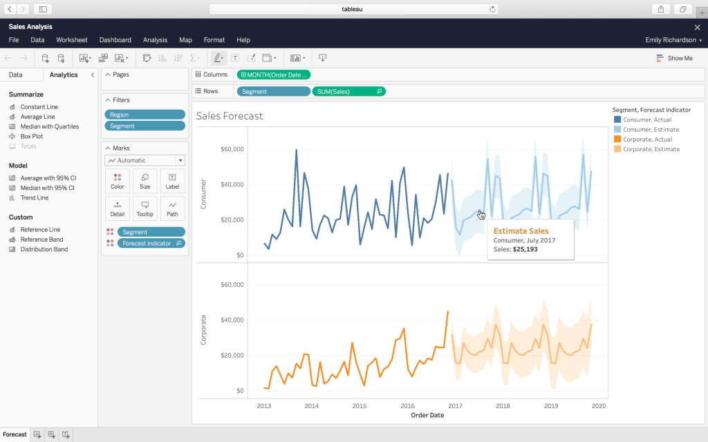
The image below shows the visualization creation studio for Tableau with variables available for selection on the far left, filters and metrics in the center, the variables selected by axis center top, and the visualization center. One useful feature of Tableau is there are built in latitude and longitude variables for general geography units making map creation an easy process. Also, compared to R and Python, the user interfaced is easy to pick up with everything as selections and drag-and-drops.
One disadvantage of Tableau is it is relatively expensive compared to other options in this list. You can download and get pricing information Tableau here.
- Qlik
Qlik is very similar to Tableau, however, Tableau is a visualization tool whereas Qlik is an analytics platform as Qlik offers other features such as data warehousing and ETL capabilities. Qlik seeks to create an easy-to-understand interface to make visualization more accessible by using Artificial Intelligence (AI) and drag-and-drop features.
There are multiple options for using Qlik software with the two main products being QlikView and QlikSense. QlikView offers the simpler version that is more comparable to Tableau as its purpose is to create highly interactive visual dashboards.
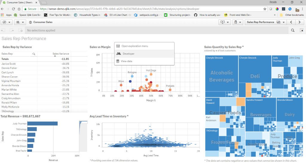
QlikSense, on the other hand, is a platform-based product that offers all the capability of QlikView plus open APIs, multi-cloud services, and an offline mobile mode. The picture below shows an example of a final visual dashboard with interactivity created with Qlik software.
Qlik is most similarly priced to Tableau and they are often compared in functionality as well. You can download Qlik here.
- Power BI
The last main visualization tool is Power BI which is like both Tableau and Qlik but is a Microsoft product and therefore integrates easily with other Microsoft products such as Excel, PowerApps, and the rest of the Power Platform. Power BI also can work on multiple platforms offering desktop, online, and mobile versions. Since most HR departments are currently using Excel as their main analytical tool, Power BI becomes a natural option to introduce more advanced analytics into the department.
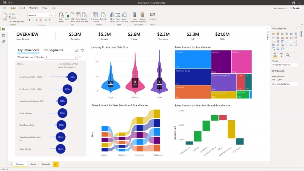
Power BI can pull data from multiple sources including SQL databases, APIs, and pivot tables from Excel to create aggregated data sources to build interactive dashboards from. An example of dashboard creation in Power BI is provided below. While Tableau and Qlik also create aggregated datasets, the connectivity of Microsoft products allows for a much easier transition between apps.
One downside is Power BI is not included in the cost of Office 365 and requires an additional purchase, however, most options in this list are costly and given the powerful integration this option offers, it is a strong competitor to Tableau and Qlik. You can download Power BI and get pricing information here.
- SPSS
SPSS is a statistical software that also provides strong visualization tools and can integrate well with Excel, R, or Python to gain even more capabilities. The main difference between SPSS and the last few products is SPSS does not aggregate data from multiple sources, instead it focuses on analyzing data from a single source.
SPSS is one of the most common statistical tools used in social sciences since it has a user-friendly interface, so you don’t need an in-depth understanding of statistics to create insightful graphics and analysis. Since SPSS is used for social science analytics, it makes it an easy introductory software for HR professionals to use.
There is other similar software to SPSS, such as SAS or Stata, but given that SPSS is most likely to already be known by HR professionals, it makes it the best choice of the three. SPSS also has a lot of features like Excel which make it easier to learn than its competitors. SPSS is great for entry level analytics, such as regression or correlation, but if you want to do more advanced analytics, R is more powerful overall.
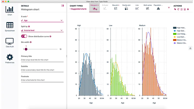
Below is an example of building a graphic in SPSS with the user-control panels. You can get pricing information and download SPSS here.
- Excel
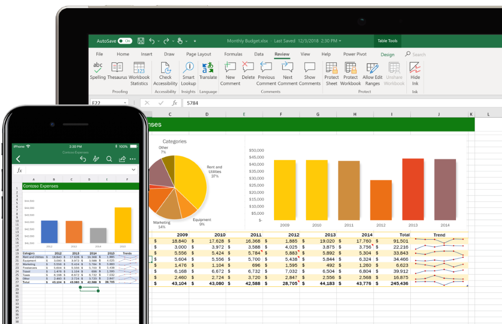
The final analytics product is the most common one by far: Excel. While Excel is used in nearly every workplace, the full capabilities of this software are not fully reached at most. Excel is also usually the first analytical software people are introduced to and runs and edits most spreadsheet files, including csv.
Some features of Excel include:
- Transform datasets into tables for easy navigation and sorting
- Additional packages for more advanced analytics, such as ToolPak
- Formulas to automatically change with changes in the dataset (just don’t keep formulas for large datasets, instead change them to numeric values to limit memory use)
- Filtering to easily identify categorical variables
- VLOOKUP which allows you to connect multiple datasets easily
- Pivot tables to summarize large amounts of data
Overall, Excel is a very powerful analytical tool if used correctly and most people already have an introduction to it. For more information on Excel, this website provides the downloads and links to guides and blogs to get more information on how to get the most out of Excel.
This article is part of a special series on data analytics, see part 1 here.
